The Challenge:
The assignment entailed developing a logo for a given brand name, complete with scenario, positioning, and attributes. The task included designing a brandmark, visual identity, and a brand experience book to define the brand's verbal and visual voice. We were to conduct trademark research for potential brand names in the Canadian and US markets and create a messaging matrix for the rebrand launch campaign.
Given Scenario
Corporate Name: Quaro Software Inc.
Brand name: Quaro
Stakeholders: Consumers (individual, institutional, corporate), employees, investment community, media, software retailers
Competitors: Adobe, Figma, Microsoft, SmithMicro Software, Extensis, Apple, Canva, Dell, other computer hardware, software brands
Positioning Statement:
Quaro empowers creative professionals everywhere in the world. Our full suite of products, including Quaro Draw, Quaro XPress, Quaro Publishing Platform, Quaro Docurated, MindManager, Parallels, PaintShop Pro, Painter, Pinnacle, Roxio, VideoStudio, WinDVD, WordPerfect Office and WinZip, provides the power to writers, designers, filmmakers and other artists to create. Our integrated approach to digital software ensures that our products and services are exciting and affordable.
Background:
Adobe, over the past several years has captured most of the market of software aimed at the creative industry. Adobe effectively forced out all competitors with its software bundles such as Creative Cloud (formerly Creative Suite) with Illustrator, Photoshop, InDesign, PremierPro, etc. They angered their customers though, when Adobe introduced Creative Cloud, which has a subscription fee structure.
This has created an opening an opening for a competitor.
Alludo (formerly Corel), which originally was just a lower-cost, less powerful graphics software company aimed at the PC market, realizes that in order to not just grow, but also survive; it has to offer suites that are competitive to Adobe’s packaged software bundles. Quark makes QuarkXPress, which used to be the dominant desktop publishing software, but found its market share collapse when Adobe introduced InDesign. Alludo and Quark have therefore decided to merge.
Attributes

Logo Design
Rational Alignment with Brand’s Attributes
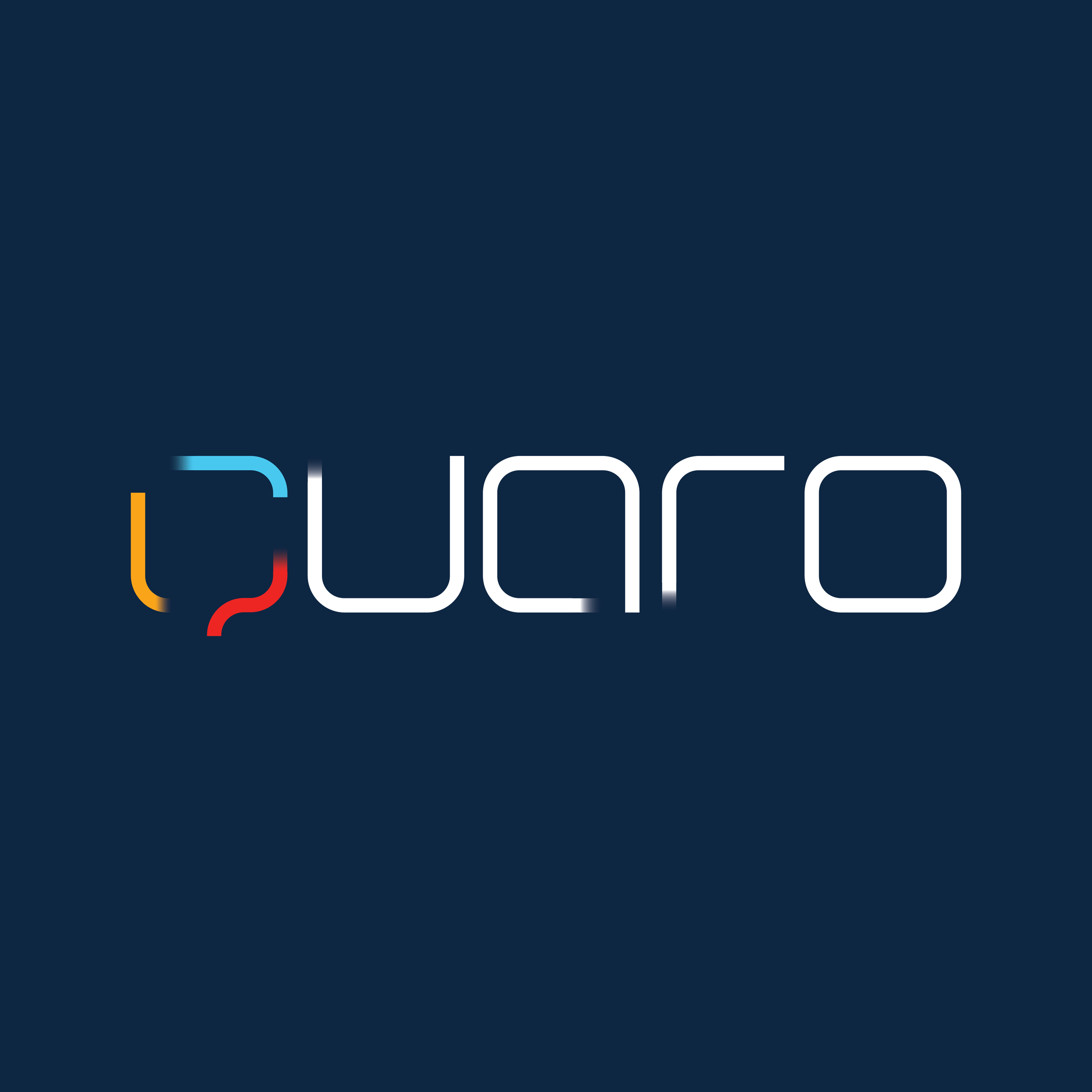
The logo's design captures the essence of being Integrated, Innovative, Quality-driven, and Creative. It's designed in a way that ensures easy replication across various mediums while maintaining brand consistency.
The 'Q' shape, crafted from three coloured lines intertwining, symbolizes Power and Strength. The line that extends beyond the cycle epitomizes Creativity and Innovation, illustrating the brand's forward-thinking mindset.
The dynamic aspect of the design embodies Excitement, Evolution, and Empowerment. This movement suggests a brand that is always advancing and energizing.
The perfectly closed cycle of the 'O' letter conveys a sense of Perfection and Maturity, reflecting the brand's commitment to excellence and completeness.
The selected colours and the way the coloured lines integrate are intentionally chosen to represent Excitement and the brand's Global presence, appealing to a diverse, worldwide audience.
The use of a bended, minimalistic font style strikes a balance between Accessibility, Affordability, and Professionalism. It ensures that the brand is perceived as both approachable and high-caliber.
The Q design is versatile enough to serve as an app icon without losing its essence or recognizability.
The letters of the wordmark have been deliberately chosen in a thin shape, emphasizing the Elegance and Detail-Oriented nature of the brand. This refined typography reflects a sophisticated and meticulous approach, showcasing the brand's dedication to finesse in every aspect of its identity.
Imagery Style Overview
Atmospheric
Focuses on spaces, atmospheres, and details.
Conceptual illustration
Mixing colours with dominant black and white background
Depersonalized
We see people, but they aren’t the primary focus of the image.
Personal
Highly personal, capturing them in a moment, not posing for the camera, focus on facial expressions, no direct eye contact
Graphic Element
In the brand's visual identity, the distinctive three-line element symbolizes integration and the brand’s core values. Always presented in the sequence of blue, yellow, and red, these lines should be equal in thickness and can be adapted into any shape or configuration. The key is to ensure they convey a sense of motion, reflecting the brand's dynamic and progressive spirit.
Here are two samples showcasing how these guiding principles come to life, demonstrating the versatility and energy of our brand's graphic signature.
Corporate Type Families
Brand Color Palette
Primary Colors
Secondary Colors
Neutral Colors
Key Applications
Stationary Sample
Vehicle
Ford Transit Connect
Website Homepage
Launch Campaign
Brochure Cover
Audience: Employees
Newspaper Ad
Audience: Consumers
Trade Magazine Ad
Software retailers


